Booking Flow
COMPANY
Glamsquad
TEAM
UX Designer / Researcher (Erin Pienta)
Senior Product Designer (Me)
Backend Engineer (Rohail Altaf)
Frontend Developer (David Weiss)
PLATFORMS
Website (Mobile and Desktop)
WHO IS GLAMSQUAD?
Glamsquad is an on-demand beauty service provider in the 6 major cities of New York, Los Angeles, San Francisco, Miami, Washington DC, and Boston. Glamsquad provides hair, makeup, and nail services at any location and any time.
PROBLEM
Glamsquad's booking flow hadn't been updated in over 2 years. Though it was optimized through small changes and tweaks along the way - we got a lot of feedback from first time users that told us we needed to re-think the current flow. We also had large drop off numbers in our funnel (seen below).
PROBLEM
Clients have a high level of anxiety leading up to an appointment. Our Customer Service team gets on average 3,000 text message complaints and 767 calls per day on lateness.
GOAL
GOAL & KEY RESULT
Improve First-Time User Experience. Address questions and concerns from our First Time User study while allowing clients to book an appointment with ease, communicating important information at the appropriate time.
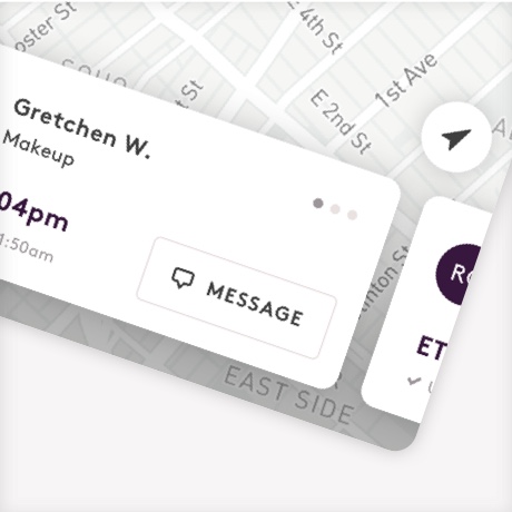
Our clients should feel in control and at ease while waiting for their appointment to start and know the status of their Pro's arrival.
Decrease weekly average % of appointments with complaints on lateness from 1.75% to 0.5%.
KEY RESULT
GOAL & KEY RESULT
Increase conversion rate from 7% to 10%.
Our clients should feel in control and at ease while waiting for their appointment to start and know the status of their Pro's arrival.
Decrease weekly average % of appointments with complaints on lateness from 1.75% to 0.5%.
Understanding Pain Points
Understanding Pain Points


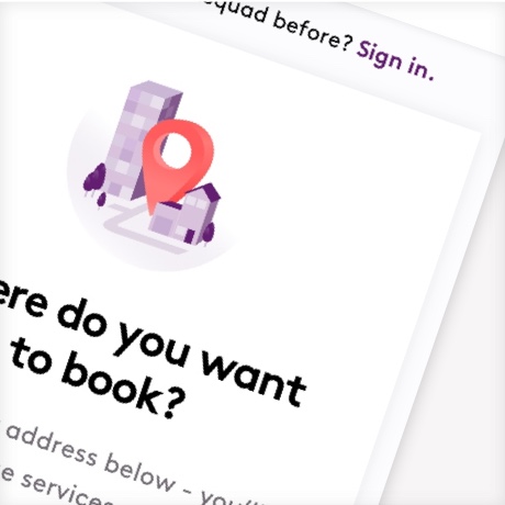
Tell us your city address, we'll show available services.
Understanding Pain Points
Glamsquad formerly had a city selector so that users could see services available in each location (for example, nails are not available in Boston). Not only is this a misnomer (New York is too vague), but it also left false validation that we were available. Users would start off excited, finding their services and later disappointed to see we couldn't serve their zipcode. We heard about this from our Customer Experience team as well as through user interviews. We also had a drop off rate of 30% at the address screen - so we hope that by frontloading address, we can save some pain for our users and let them know more immediately.
Working with our Growth and Marketing Team
I had heard formerly that booking conversion did best on ads that went directly to a services page. Because of that we decided to insert city options below so that architecturally, our marketing teams could still directly link to a services page within a particular city from their ads. This created a win-win for first time users who organically find Glamsquad as well as for those who book directly from marketing ads. Because we confirm address details later in the flow, we had a place for users who chose a city to check their address later.


A more efficient layout.
On mobile, 70% of the viewport was taken up by directions throughout each step. Not only is this a waste of space, but this is an issue for smaller devices. On desktop, the space was divided and contrasted in such a way that your eye moves around and isn't sure where to focus.
We opted for a cleaner look with lots of white space - and one action to focus on at a time.
What's included in our services?
Over the course of a few years, there were consistent misconceptions and common questions associated with particular services. Thing like...
"Is ironwork included in a blowout?"
"Will they wash my hair or do I need to?"
"What nail polish colors are available?"
.


Inform the user on what's included in each service as they add it to their appointment.
With so much feedback being specific to each service - we added a tip call out to each Service modal to call out important things and answer common questions.
While it wasn’t a goal to increase AOV, there was certainly an opportunity to do so. We didn’t want add-ons to distract from adding the service, but we did want to make it visible if they chose to explore upgrading their service.
I also designed illustrations to draw the users eye to add-on upgrades for the service. We plan on A/B testing these to see how they effect AOV and conversion.
.


Make sure key actions, such as date and time, are focused and obvious to tap on.
The user already entered their location information at this point in the old flow - so carrying it over felt a bit inefficient and drew the focus away from date/time, despite that directions are important! We made date and time much more clear as the next key step in the flow and followed up with finishing location details right after.
.

Micro-interaction flexible for mutliple user types.
We needed an address field that was flexible enough to allow a user to:
• View the previously saved address
• Search for a new address
• Pull a previously saved address (return users)
I put together a prototype that showed how we could make a saved address field function simultaneously as a location search for adding a new address. If a return user, this could show multiple addresses as well as a new address CTA.

Tell users WHY we need a phone number.
During our qualitative interviews we often heard remarks about asking for phone number. So it was important to tell them that we use it for timely reminders and ETAs of their beauty pro.
We also have the option to continue with facebook. Previously, we put this at the top of our sign in forms, but only 20% of our user base actually used this - so we moved it to the bottom.


Offer trust and security around payment forms.
We previously offered a standard payment form with credit card number, expiration, and CVC code. As you can see, this form looks very sparse and does not leave reassurance that your information will be protected.
We added major credit cards that we accepted as well as a stripe badge (stripe is a relatively popular payment processor). Not only does this help the users eye immediately recognize this is a payment form, but it also provides some sense of familiarity and security. We also added a short line to say their information is protected, which we can always A/B test later on.
High-Fidelity Designs