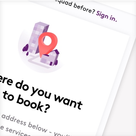
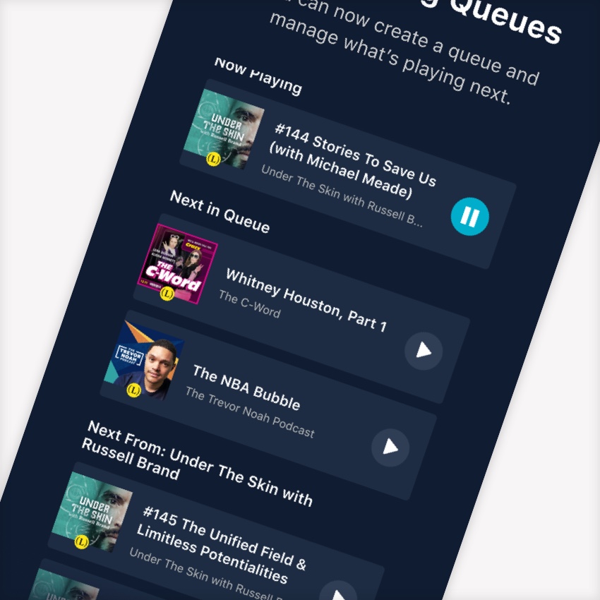
Introducing Queues
PROBLEM
Users had no way to view what would play next and no control as well. For any podcast app, a user expects to be able to manage what will play next.
GOAL
GOAL
Create a Queue where users can see what's playing next as well as manually add, remove, and reorder episodes in a queue.
KEY PERFORMANCE INDICATORS
• Time spent listening (minutes)
• Feature utilization: % of total users who use vs. do not
• Reduce CS Tickets Related to Episode and Playback Organization
COMPANY
Luminary Media
Luminary is a subscription podcast network with original podcasts from creators like Trevor Noah, Russell Brand, Lena Dunham, Roxane Gay, Rainn Wilson, and more.
Luminary is a subscription podcast network with original podcasts from creators like Trevor Noah, Russell Brand, Lena Dunham, Roxane Gay, Rainn Wilson, and more.
Luminary is a subscription podcast network with original podcasts from creators like Trevor Noah, Russell Brand, Lena Dunham, Roxane Gay, Rainn Wilson, and more.
PLATFORMS
iOS App
Android App
Competitive Analysis
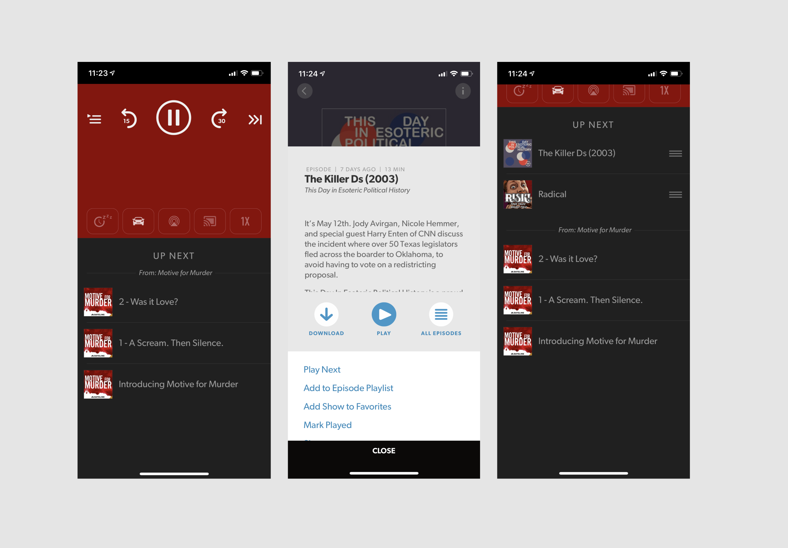
Spotify
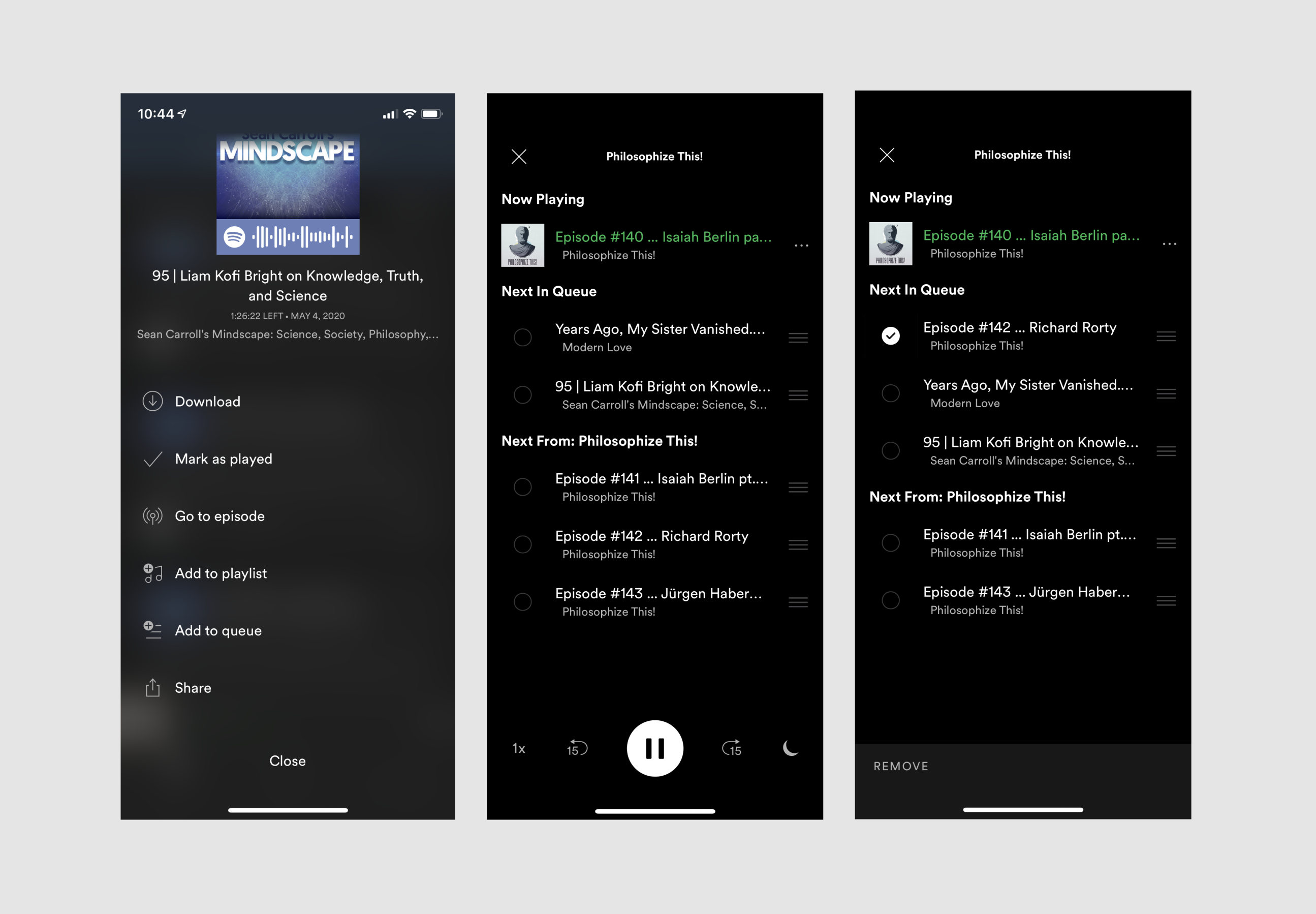
Spotify's experience prioritizes queue management. Users could re-order and delete immediately without going into an "edit" mode.
The cons were that there was no way to clear the queue in an easy manner. Recognition of podcast episodes was also tough without the artwork.
Spotify's experience prioritizes queue management. Users could re-order and delete immediately without going into an "edit" mode.
The cons were that there was no way to clear the queue in an easy manner. Recognition of podcast episodes was also tough without the artwork.
Stitcher
Stitcher pushed their queue below the full player and relied on the swipe gesture for delete. They didn't have any options for clearing the queue or deleting episodes that were automatically programmed to play next.
Stitcher pushed their queue below the full player and relied on the swipe gesture for delete. They didn't have any options for clearing the queue or deleting episodes that were automatically programmed to play next.
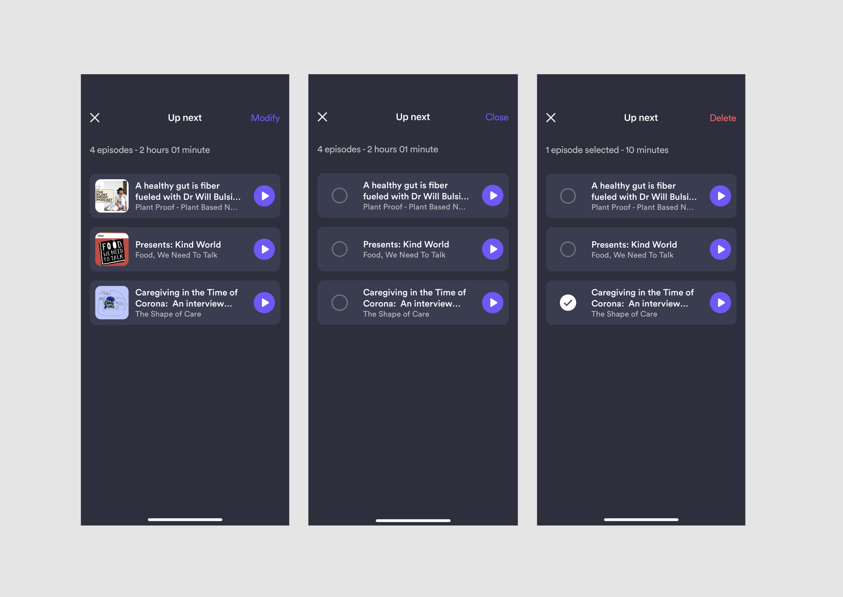
Majelan and Pocket Casts
Majelan had a "modify" action in the upper right that allowed users to go into an edit mode. Here a user could select one or multiple episodes to delete. There was no option to clear the queue however. Reordering was also something one had to discover with press + hold to drag it elsewhere in the queue.
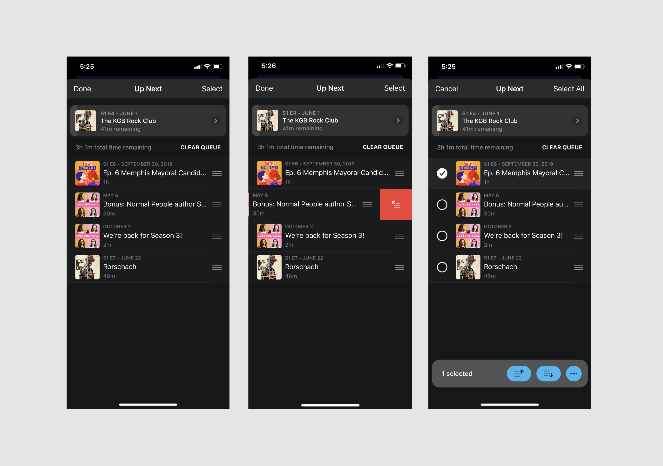
Pocket Casts had a pretty similar layout and extensive actions to take in a Multiple Select state. One could delete, download, mark as played, and archive episodes in the queue. I wasn't quite sure what the difference was between delete and archive and felt that the amount of actions available through the "..." in the lower right may not have been the best trade off for a one-click delete action.
Simultaneously, the select state offered a move up, move down button in addition to a drag-and-drop hamburger interaction. Overall, Pocket Casts seemed to prioritized multiple functionality over simplicity.
Considerations and Trade-offs
Considerations and Trade-offs
An example of our current delete episodes pattern.
Utilize our current delete episode pattern.
We just finished building a delete episode pattern in another part of the app. We wanted to re-use that for consistency and development speed. This also informed some decision making for the next item.
Note: Design of episodes here shows an older version. I redesigned and improved them in a separate project, which I used in the queues design.
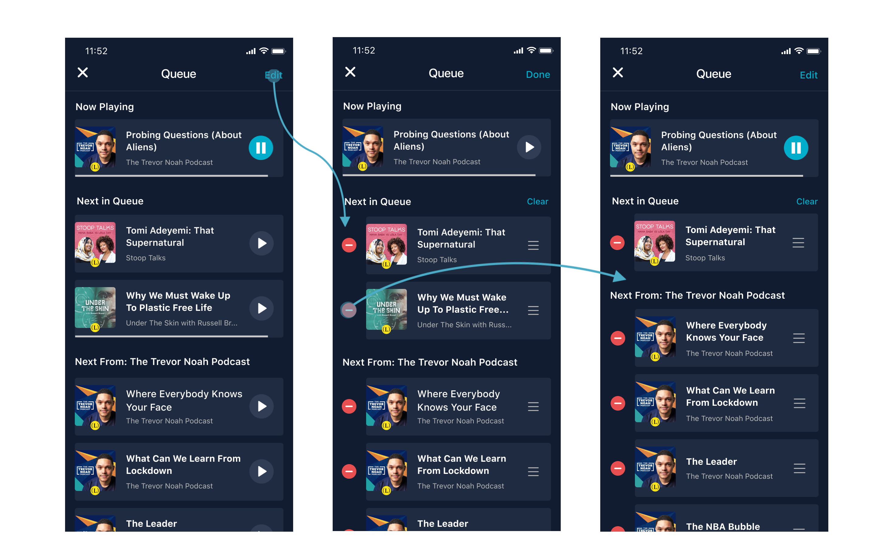
Utilizing the same delete pattern for the Queue.
Prioritizing the ability to see Episode Detail Page over immediate reordering.
Although Spotify offered an immediate "play" action by tapping an episode row's title (allowing reorder to replace a play button) – this was not a current pattern in our app, which had individual play buttons and episode title's linked to an episode detail page with more info and more actions.
With podcasts, there is more commitment to play–so replacing an "episode info" tap target for "Play" was risky and inconsistent with the rest of the app.
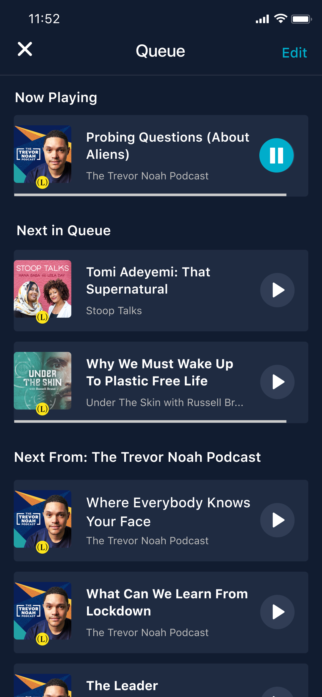
Create Organization & Clarity Around Manual Queue and Auto-play
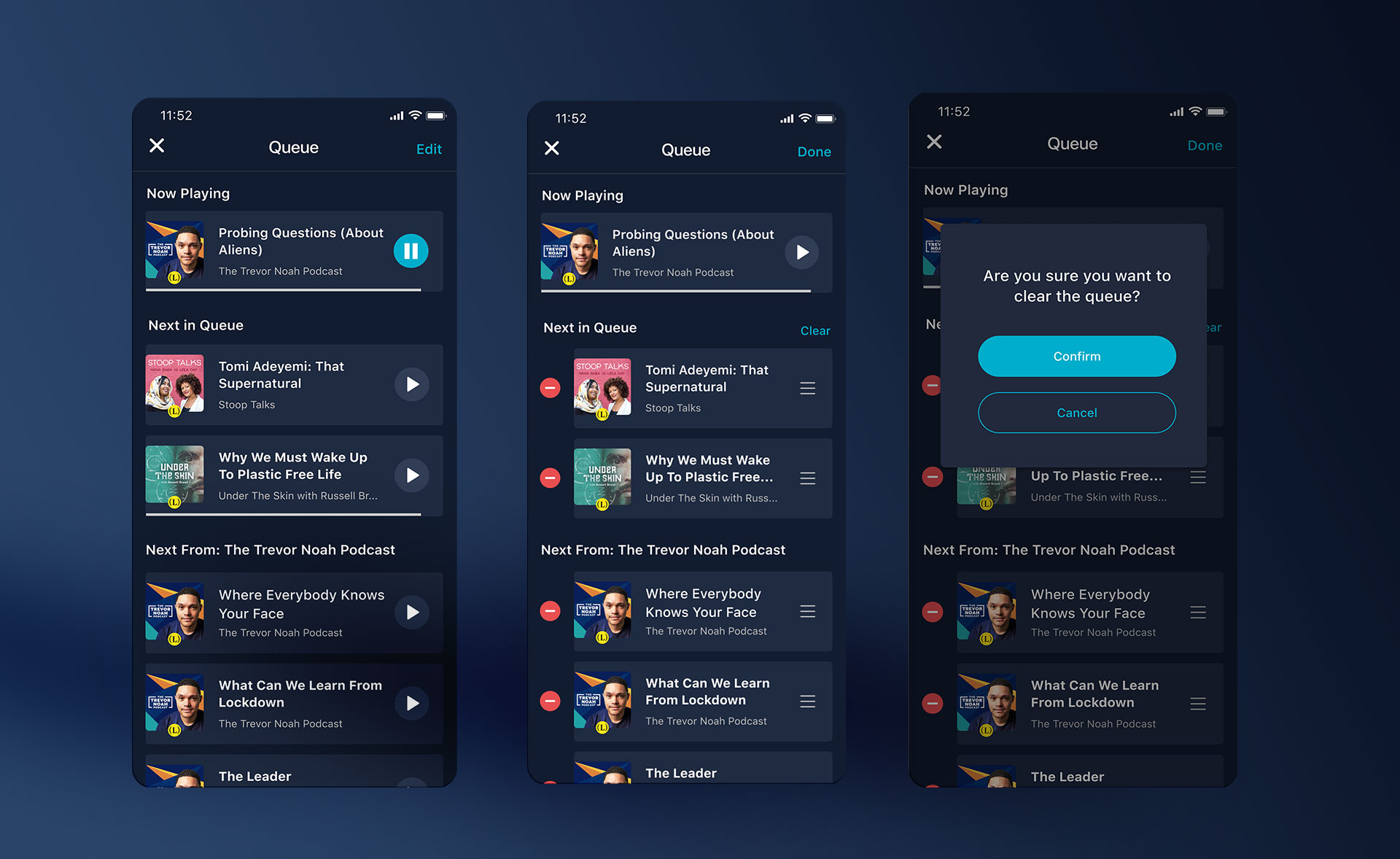
We had programmed areas of the app where the next episode in a podcast would auto-play once you finished your current listen. We needed to be able to distinguish sections where users could see both what they manually added as well as what would follow up after if they were in the middle of an auto-play series.
Other logic cases we needed to consider:
What happens when a user plays an episode in the middle of "Next From" when they have a manual Queue?
We kept their manual queue and removed all prior episodes within the autoplay group.
What happens when a user plays an episode in the middle of their manual Queue?
We remove any episodes prior to the episode picked and any that follow remain in the queue.

Adding to Queue
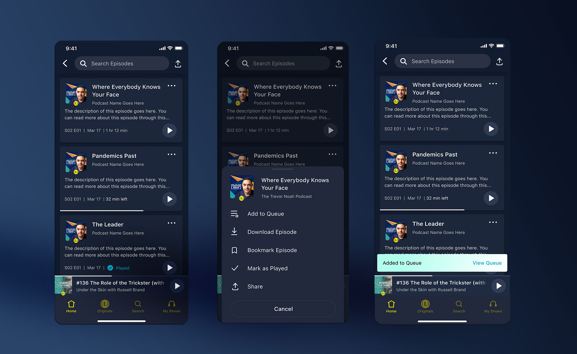
We utilized our newest action sheet design to implement Add to Queue across the app. Anytime a user tapped the "..." icon in the upper right, they would be provided with multiple actions available for an episode – now including Add and Remove from Queue.
***It's worth noting that we were considering putting an 'Add to Queue' action directly on episode cards, but wanted to measure usage before making such a change.
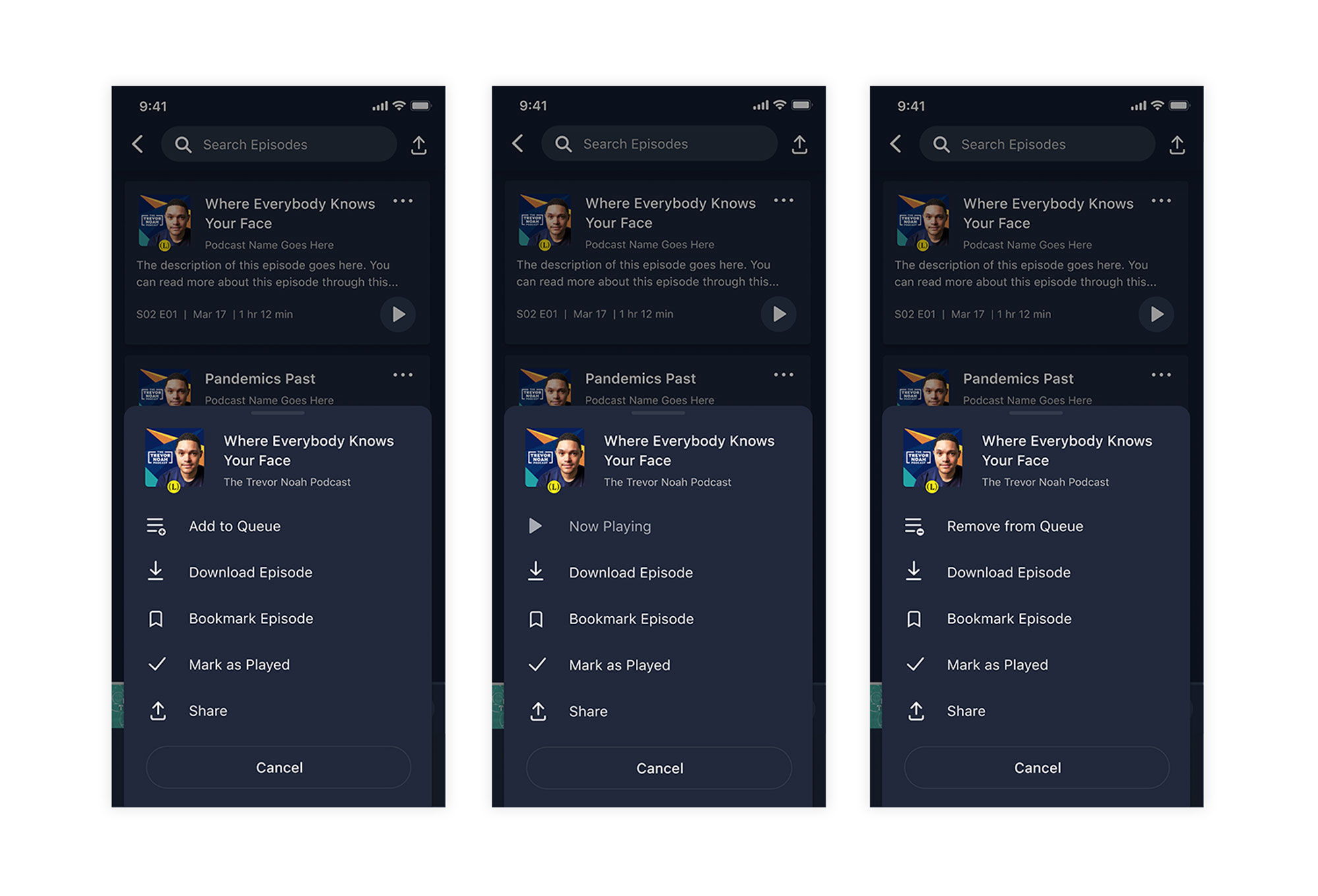
The action sheet would now need both an Add to Queue state, Remove from Queue state, as well as a Now Playing state. It didn't make sense in podcasting to be able to add an episode more than once (unlike in music) so a binary state was the right decision.
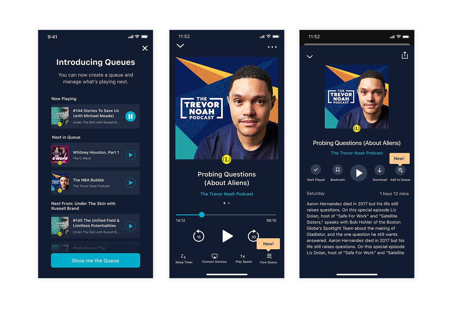
Discovery of Queues
How would our users find the queue?
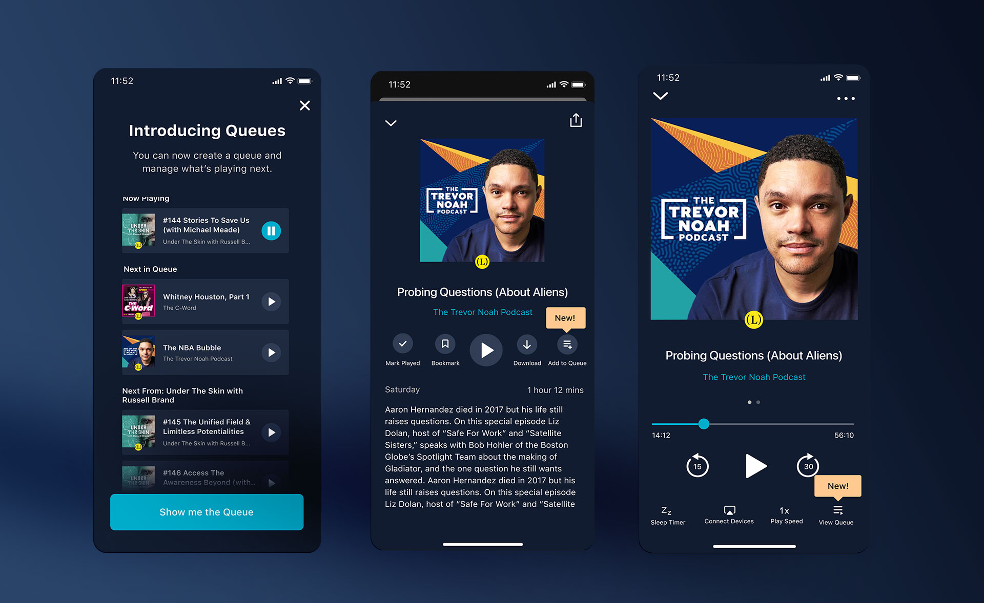
About 50% of users engaged with the full player (middle screen above) with each session so we knew it wasn't too out of the way to provide a View Queue link.
We also concepted adding it to the mini-player, but for the initial scope of the project we thought it better to keep the entry point less obvious and track it's engagement and usage. If the feature became popular, perhaps we would make Viewing the Queue more prevalent.
Of course, it's important to educate users about new features. We utilized a Braze in-app modal and our pre-built in-app tips to point users in the right direction as to where to find the queue and how they can add to queue.
Data Opportunity
Apart from scoping out what we would track to measure the success of this new feature, I was thinking about what would help engagement.
I suggested we track which episodes our users add to queue and save the episodes they never get to in a list to recommend later.
It's fairly common to start a queue and have life get in the way and never finish it. Why not save that information for later?
Conclusion
We released in various stages and found the following:
"Up Next" Release: Users could only see what was playing next without management.
- KPI's were not affected in this release.
"Queue" Release without Discovery: Full management of queue was open, but we hadn't yet pushed the discovery portion as we wanted to make sure bugs, etc were fixed first.
• Time spent listening (minutes) increased by 3%
• Feature utilization: 11% of users utilized the feature / 89% did not
• Reduce CS Tickets Related to Episode and Playback Organization: 15% decrease
"Queue" with Discovery portion: Full management of queue is open along with a braze modal introducing the feature and in-app tips.
• Time spent listening (minutes) increased by 6%
• Feature utilization: 26% of users utilized the feature / 74% did not
• Reduce CS Tickets Related to Episode and Playback Organization: 64% decrease
In conclusion, discovery and introduction of the feature improved our metrics a lot. As a follow-up, we wanted to dig further into engagement in episodes to encourage utilization of the queue. We also wanted to consider moving the queue to a more visible place.
