Glamsquad Design System
COMPANY
Glamsquad
PLATFORMS
GSPro (Stylist App)
Introduction
UNDERSTANDING GLAMSQUAD'S HISTORY
Like many start-ups, Glamsquad was moving so fast in it's first years that structure in it's design system and style guide fell to the side. In order to audit and implement this for Glamsquad, first I needed to get a better understanding of it's current status. Glamsquad's GSPro app is used by stylists to manage their schedule and appointments. This platform has had the least put into it in terms of design - so we thought it a great place to start.
In an ideal world, we would implement a brand new style guide that was perfect for Glamsquad. The reality is, even after this style guide is completed - it will compete in priority with other initiatives Glamsquad has planned. As a designer, I believe a Style Guide and Design System is foundational to the success of any company. A strong style guide should also be in touch with the technical limitations and opportunities of the platform.
My approach was to:
• Understand Brand Story and Mission
• Find the inconsisties in design approach and styling
• Evaluate what's working and what's not
• Understand tech limitations and advantages for implementation
• Bring consistency and find opportunities for improvement
Brand Story
Glamsquad is set on becoming the on-demand beauty service, empowering client's to look and feel their best without needing to leave their home and empowering Stylist's to be able to work when they want and not having to sit at a salon all day.
Because this project is focused on the Pro's experience with Glamsquad - we strongly believe the quality of the product will directly transfer into the quality of the service. We needed to make the experience delightful and easy-to-use. Unlike the Client experience, it did not need to focus as much on glamour, but more so on a breathable user-friendly experience that was easy to read as you were on-the-go.
Of course, a touch of glam and beauty is an option. Afterall, they are artists themselves using this app.
*Please note: This project is currently in-process and will take a lot of iteration as we continue to design for new projects with new needs and components.

Sketch symbols as seen above are wonderful, but can easily get lost, duplicate, and be hard to find and show others in an organized manner.
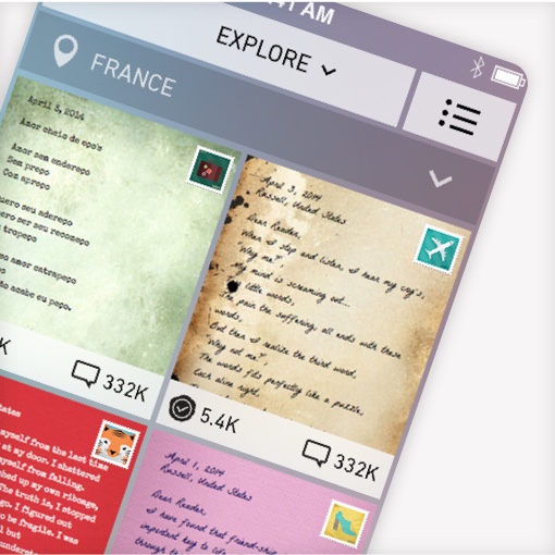
Current Status

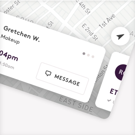
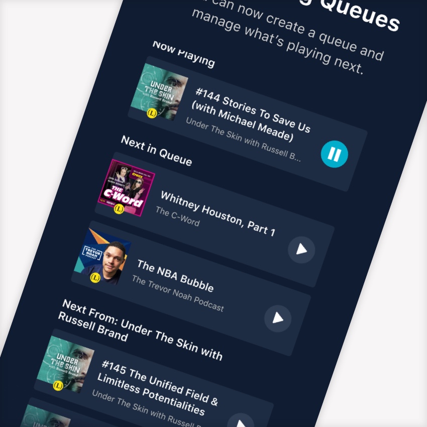
A few examples of GSPro and it's current design.
GSPro was initially designed with function being the utmost importance. As you can see there are inconsistencies in button colors, icon weight, and there is seemingly no real hiearchy in the text styles. Through this design I can already see a transformation that would not require a rehaul of the entire app from front to back, but rather one that can be implemented slowly.
Shortcomings:
• We can stick with the san-serif font 'Brown' and simply alter the size/weight hiearchy to achieve a sense of order
• We can change all the buttons to be one color (our main brand color 'Eggplant') and leave red only for errors and extremely important call outs.
• Refine the overall Palette to more intentionally picked UI colors
• Choose an icon weight that pairs well with the new Text Styles
• Implement delight with illustration, again pairing well the the Text Styles and Palette
Here's a style guide I put together for GSPro after evaluating and auditing the current app.


Invision's DSM
We took advantage of Invision's free DSM platform to help us manage and share our design system in another place with linked organization.