Maps
Maps at GetYourGuide
PROBLEM
Our product prioritized discovery based on imagery and interest, but it was lacking a deeper understanding of the location of travel.
UX research gathered that spatial orientation was a huge missing piece of our product.
GOAL
GOAL
Create an MVP map product that helps the customer better plan things to do, fill in the gaps in their schedule, and see nearby things to do.
The ultimate goal is to learn if this new feature has potential by watching engagement and gather learnings through funnel drop-off.
KEY PERFORMANCE INDICATORS
• Map click rate: 15%
• Maintain baseline CR
COMPANY

GetYourGuide is a travel product that connects people with tours, activities, and experiences worldwide.
Luminary is a subscription podcast network with original podcasts from creators like Trevor Noah, Russell Brand, Lena Dunham, Roxane Gay, Rainn Wilson, and more.
Luminary is a subscription podcast network with original podcasts from creators like Trevor Noah, Russell Brand, Lena Dunham, Roxane Gay, Rainn Wilson, and more.
PLATFORMS
iOS App
Android App
WHO IS GETYOURGUIDE?
GetYourGuide is a leading travel platform for booking tours, attractions, excursions & activities for vacation and leisure.
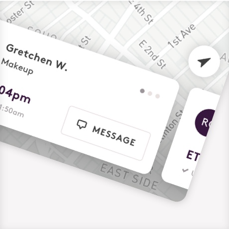
Video prototype of final map integration
How it started
Our product prioritized discovery based on imagery and interest, but it was lacking a deeper understanding of the location of travel.
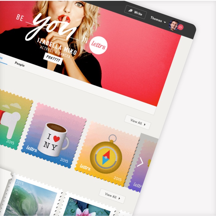
Example of the website showcasing imagery and interest based modules
App before map integration

Example of the app displaying imagery and interest based modules
UX RESEARCH DISCOVERY
Research gathered that spatial orientation was a huge missing piece of our product.
We narrowed down the research into 3 main customer problems within the discovery funnel.

CUSTOMER PROBLEM #1
Understanding & planning
Customers need an understanding of the layout of a destination so they can feel more familiar with popular areas, where, and how they might be traveling. This understanding helps them better commit to an itinerary.
“Grouping” nearby things to do is a common way of building an itinerary - all based on spatial understanding.
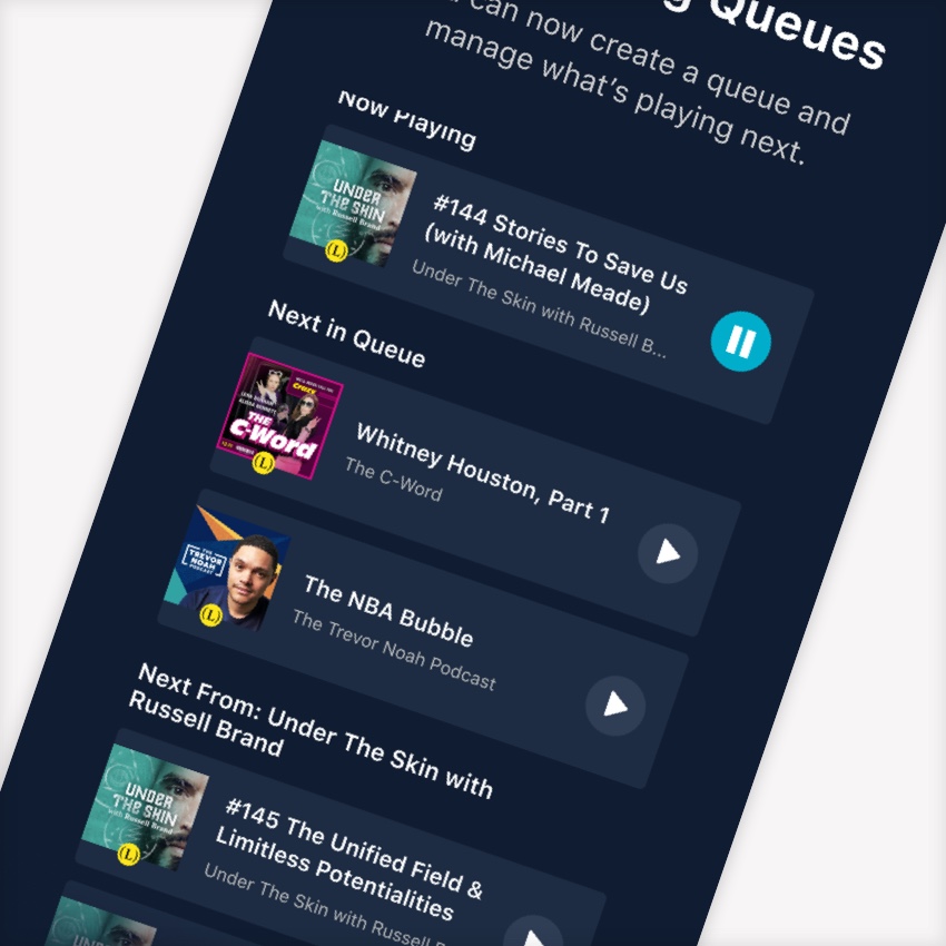
Spotify's experience prioritizes queue management. Users could re-order and delete immediately without going into an "edit" mode.
The cons were that there was no way to clear the queue in an easy manner. Recognition of podcast episodes was also tough without the artwork.


CUSTOMER PROBLEM #2
Filling in the gaps
Customers need for last minute activities that fit their schedule and are in a feasible location.
Ex: They may have a restaurant booking or something else planned for the day that they need to orient their day around.
Spotify's experience prioritizes queue management. Users could re-order and delete immediately without going into an "edit" mode.
The cons were that there was no way to clear the queue in an easy manner. Recognition of podcast episodes was also tough without the artwork.


CUSTOMER PROBLEM #3
Validating decision
As a customer is getting ready to commit to an activity, they often need a map to understand things such as a meeting point (for walking tours and other complex activities) or what stops the tour is making.
Spotify's experience prioritizes queue management. Users could re-order and delete immediately without going into an "edit" mode.
The cons were that there was no way to clear the queue in an easy manner. Recognition of podcast episodes was also tough without the artwork.
Note: A separate team was already working on solving this customer problem. Although we shared insights and thoughts, our team was left to solve the other two (above).
Spotify's experience prioritizes queue management. Users could re-order and delete immediately without going into an "edit" mode.
The cons were that there was no way to clear the queue in an easy manner. Recognition of podcast episodes was also tough without the artwork.

Current map usage within product

Competitive analysis and research guidelines from Baymard Institute
GUIDELINE #1
List view and map view should have a 1:1 relationship

❌ Map is not at all connected to the list view so when you switch - you are thrown to somewhere very different and unrelated
❌ Map is not at all connected to the list view so when you switch - you are thrown to somewhere very different and unrelated

✅ Map is connected to list view and both update as the user interacts
✅ Map is connected to list view and both update as the user interacts
GUIDELINE #2
Cluster pins by using numbers to not overwhelm
GUIDELINE #3
Price or other value can be important to show directly on a pin. Perhaps when the price filter is used.

✅ Tripadvisor and other apps using numbers to help a customer zoom on popular areas.
✅ Tripadvisor and other apps using numbers to help a customer zoom on popular areas.
✅ Once filters are introduced, map pins can become informative for narrowing purposes.
✅ Once filters are introduced, map pins can become informative for narrowing purposes.

❌ When using Airbnb’s mobile web maps, it crashed repeatedly and was unusable.
❌ When using Airbnb’s mobile web maps, it crashed repeatedly and was unusable
GUIDELINE #4
In general, avoid maps on mobile web when possible due to slow processing and frustration
This helped us eliminate mobile web from the product choice space and stick to pursuing app first, then desktop.
This helped us eliminate mobile web from the product choice space and stick to pursuing app first, then desktop.

HYPOTHESES
If we provide customers with a map of possible things to do, customers will be able to better plan things to do and to fill in the gaps in their schedule.
In addition, if we provide customers a personal location indicator, customers will be able to find things to do nearby.
RISKS & MITIGATIONS
We will be taking customers away from a high-performing discovery page for an MVP product that will not have as much filtering and curation. We risk negative CR due to moving traffic to this new feature, which will take time to invest in.
The ultimate goal is to learn if this new feature has potential by watching engagement and gather learnings through funnel drop-off.
Design variations & decisions
Map placement and navigation

Idea 1 💡 Toggle between list and map view
Idea 1 💡 Toggle between list and map view
Here's why we didn't choose this...
Here's why we didn't choose this...
BASED ON PREVIOUS UX GUIDELINES
To create a 1:1 matched toggle experience - we would need to accommodate these various types of filters as well as search capabilities on the map.
To create a 1:1 matched toggle experience - we would need to accommodate these various types of filters as well as search capabilities on the map.
BASED ON ENGINEERING FEEDBACK
We had major work being done on our backend that would make filtering and searching on maps too complex for an initial launch.
We had major work being done on our backend that would make filtering and searching on maps too complex for an initial launch.

Idea 2 💡 Separated map with slide up list view
Idea 2 💡 Separated map with slide up list view
Here's why we chose this...
PRAGMATIC DECISION
Allowing the map to be a separate experience allows us to use less development time, while still gaining learnings on our hypotheses.
Allowing the map to be a separate experience allows us to use less development time, while still gaining learnings on our hypotheses.
Map entry points

LET'S GO BOLD
We wanted the most engagement and learnings we could get from the first launch - so we opted for a larger and more imagery-based real estate
We wanted the most engagement and learnings we could get from the first launch - so we opted for a larger and more imagery-based real estate.
ENGINEERING FEEDBACK ON VERSION B
Pulling a capture of the map and pins required a lot of effort so we opted for pulling images we already had in our API for the destination placed in an illustrative mock as in Version C.
Pulling a capture of the map and pins required a lot of effort so we opted for pulling images we already had in our API for the destination placed in an illustrative mock as in Version C.
Horizontal vs. vertical scroll

DATA BASED DECISION MAKING
Many previous experiments showed us that when customers have access to vertically scroll it results in higher conversion rate compared to horizontal scroll elements.
To mitigate risks and allow customers to seamlessly compare and scroll, we decided to include this slide-up view.
Many previous experiments showed us that when customers have access to a "list view" of activities that tey can vertically scroll through, conversion rate is hgiher compared to horizontal scroll elements.
To mitigate risks and allow customers to seamlessly compare and scroll, we decied to include this slide-up view.
Nearby and location permissions

Visualization of the logic implemented with engineers on location permissions
Learnings and next steps


Maps appear to be more valuable the closer the customer is to travel.
Customers who had a date within 3 days of "today" were 50% more likely to click on the map entry point.
Customers who had a date within 3 days of "today" were 50% more likely to click on the map entry point.


💡 We can add logic to show the map based on dates, rather than assume equal priority across all date cases.
💡 We can experiment with more engaging map CTA's.

Default view upon entering maps
Our default map showed room for improvement
• 61% did not click any pins
• 61% did not click any pins
🐛 Bug discovered in usability testing
Some customers experienced a bug where the map would zoom out to show several continents. This certainly confused customers.
Some customers experienced a bug where the map would zoom out to show several continents. This certainly confused customers.

New imagined view
💡 Fix “zoomed out” bug and experiment with city center zoom vs. entire city
💡 Experiment with showing pins with more valuable or enticing design like imagery
💡 Pull up list view to encourage awareness and potentially increase conversion

In discovery, customers tend to be more comfortable exploring attractions to experience rather than nebulous non-attractions.
Ex: Musée d'Orsay vs. Montmartre walking tour
This isn't so unexpected as first-time visitors of a destination tend to hit the "top attractions" more compared to niche activities like a cooking class.
However, we do have a segment of customers that prefer unique things to do or hidden gems over top attractions - so we want to be sure not to ignore them.

💡 Integrate filters so customers can better choose what they want to experience rather than digging through a set of all things.
Ex: "Food & drink" is a filter that collects food tours, cooking classes, and other gastronomy related things to do.
Rather than tirelessly clicking through, customers can immediately filter down by interest.
Spotify's experience prioritizes queue management. Users could re-order and delete immediately without going into an "edit" mode.
The cons were that there was no way to clear the queue in an easy manner. Recognition of podcast episodes was also tough without the artwork.
Final notes
🎉 Though we had drop-off issues, maps had a 15% click rate, matching our original KPI target, which confirmed interest in this new feature.

Overall, the experiment was successful in keeping CR flat, but the work needed to bring it to a positive state would be cumbersome.
After discussions with stakeholders, maps was paused to improve our Search functionality, which had recently become more important to get right for our core product.
🎉 We celebrated the creation of a baseline experience that we would come back to later in the year and expand on.